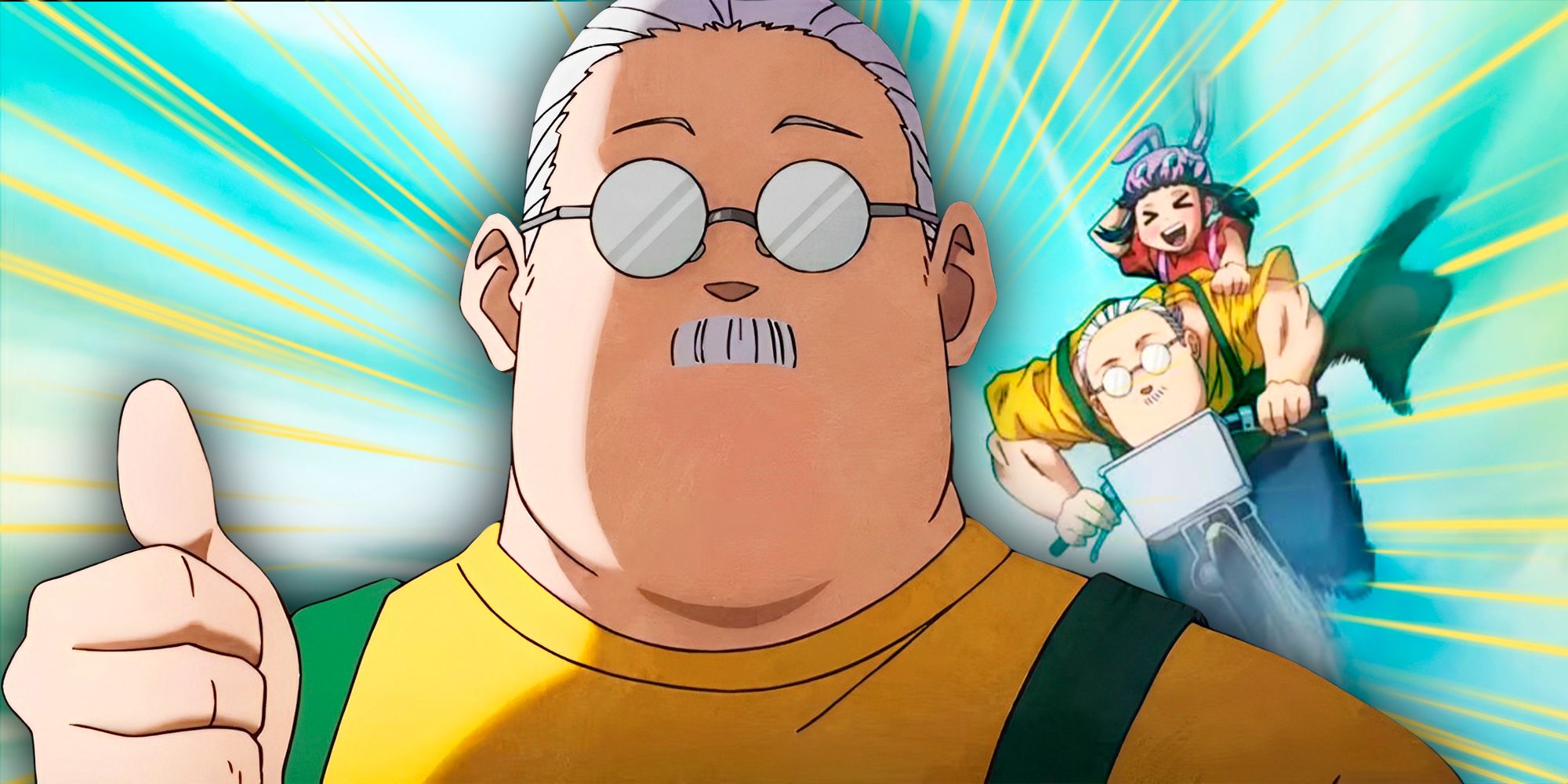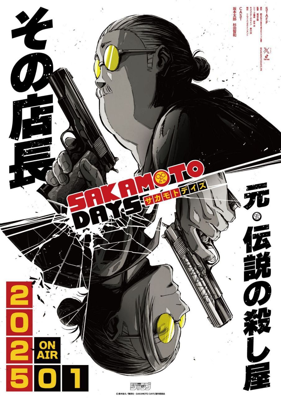
Sakamoto Days was one of the most anticipated anime adaptations in recent memory, and fans were thrilled to hear more about its production process during Anime Expo 2025. Director Masaki Watanabe opened up in a recent interview about just how meticulous the character design process was, revealing one particularly challenging hurdle that nearly threatened the anime’s visual integrity.
While many action series rely on over-the-top designs and visual gimmicks, Sakamoto Days presents a different kind of test. According to Watanabe in an exclusive interview with ScreenRant, the characters in the series are deceptively simple, lacking the kind of flashy or symbolic markers that typically make animation easier. That meant even the smallest mistake could throw everything off.
The Hidden Challenge of Sakamoto’s Character Art
Why Simplicity Made Sakamoto Days Harder to Animate
Unlike other anime protagonists with trademark accessories or standout features, Sakamoto Days characters rely heavily on subtle traits like facial shape, eye size, and line precision. Watanabe explained that this simplicity became a double-edged sword. There was no “cheat code” like a star-shaped scar or brightly colored hair to ground the viewer’s recognition.

Related
Netflix’s Sakamoto Days is almost back with its second cour, and this new trailer makes the series look more promising and amazing than ever.
Instead, animators had to obsess over incredibly fine details, especially the contours of faces and width of lines. Watanabe shared that even a slight variation in the linework could make a character look completely wrong. That level of exactness demanded constant corrections, creating delays and logistical pressure during production.
The Fight to Keep Every Character On-Model in Sakamoto Days
How Small Mistakes Nearly Broke Sakamoto Days’ Visual Identity
This design challenge was not just a minor nuisance, it posed a real threat to the series’ consistency. Watanabe admitted that maintaining the integrity of the characters required frequent revisions. A character’s identity could be lost if their eyes were a fraction too wide or a jawline too curved. In animation, where every frame counts, that level of precision is taxing.
Despite the struggles, the team’s commitment to getting it right has been clear. These painstaking efforts are what allow Sakamoto Days to retain the clean, expressive visual tone that makes the manga such a standout. Watanabe’s transparency highlights just how much discipline and artistry goes into adapting a deceptively “simple” style into moving images.
What seemed like minimalistic design turned out to be one of the most difficult parts of bringing Sakamoto Days to life.
In the end, what seemed like minimalistic design turned out to be one of the most difficult parts of bringing Sakamoto Days to life. But by overcoming those challenges, Watanabe and his team may have laid the groundwork for one of the cleanest and most faithful manga-to-anime adaptations in recent years.


