JuicyTalk
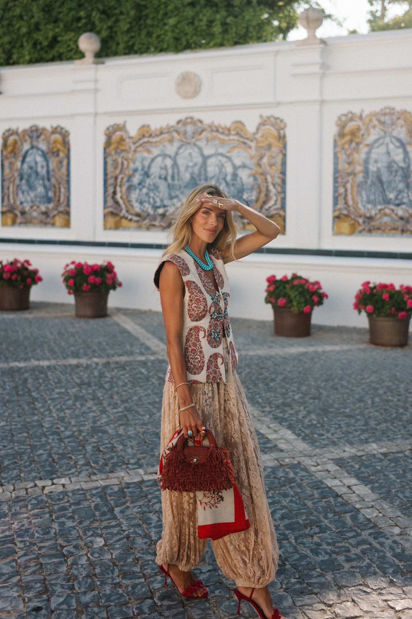
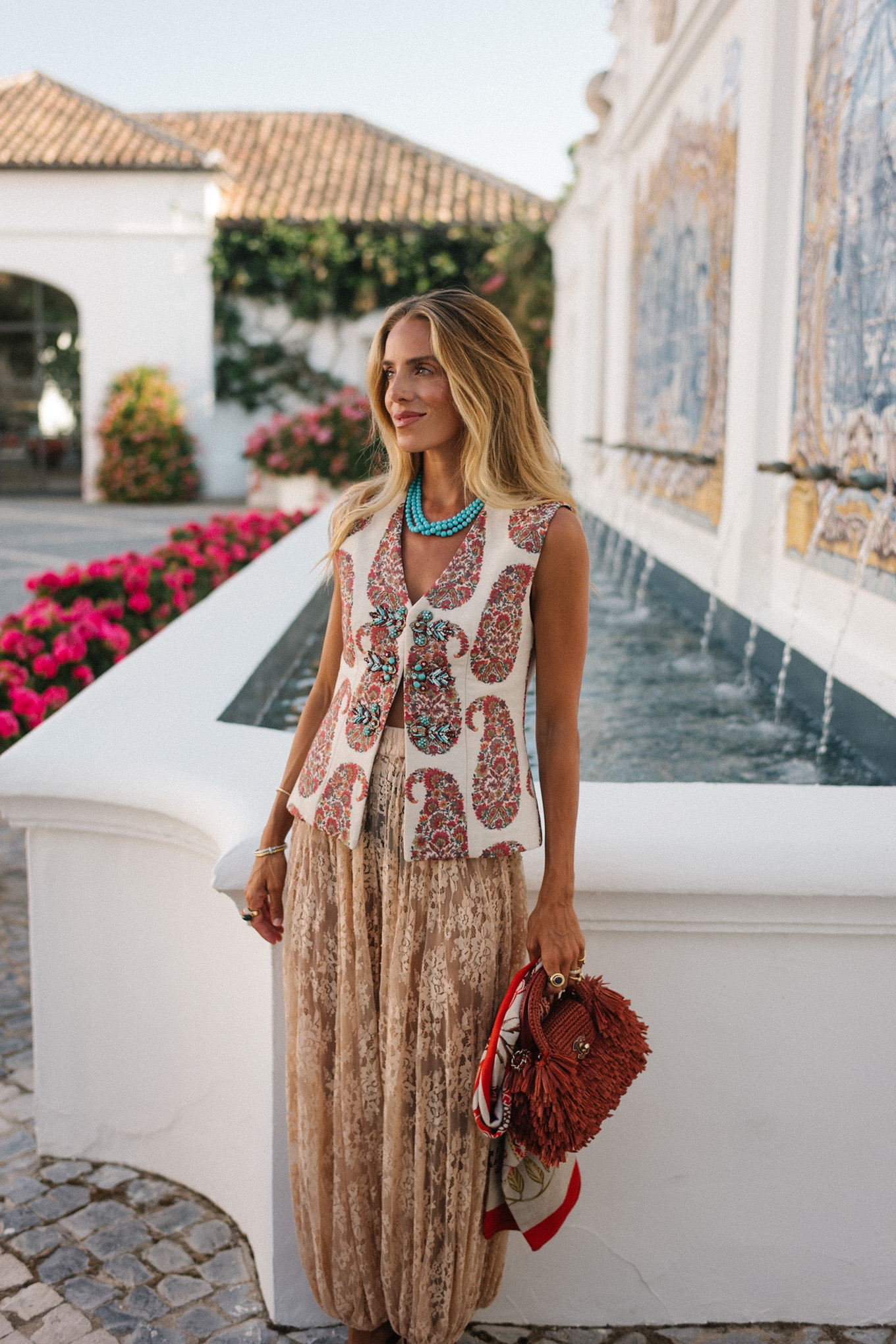
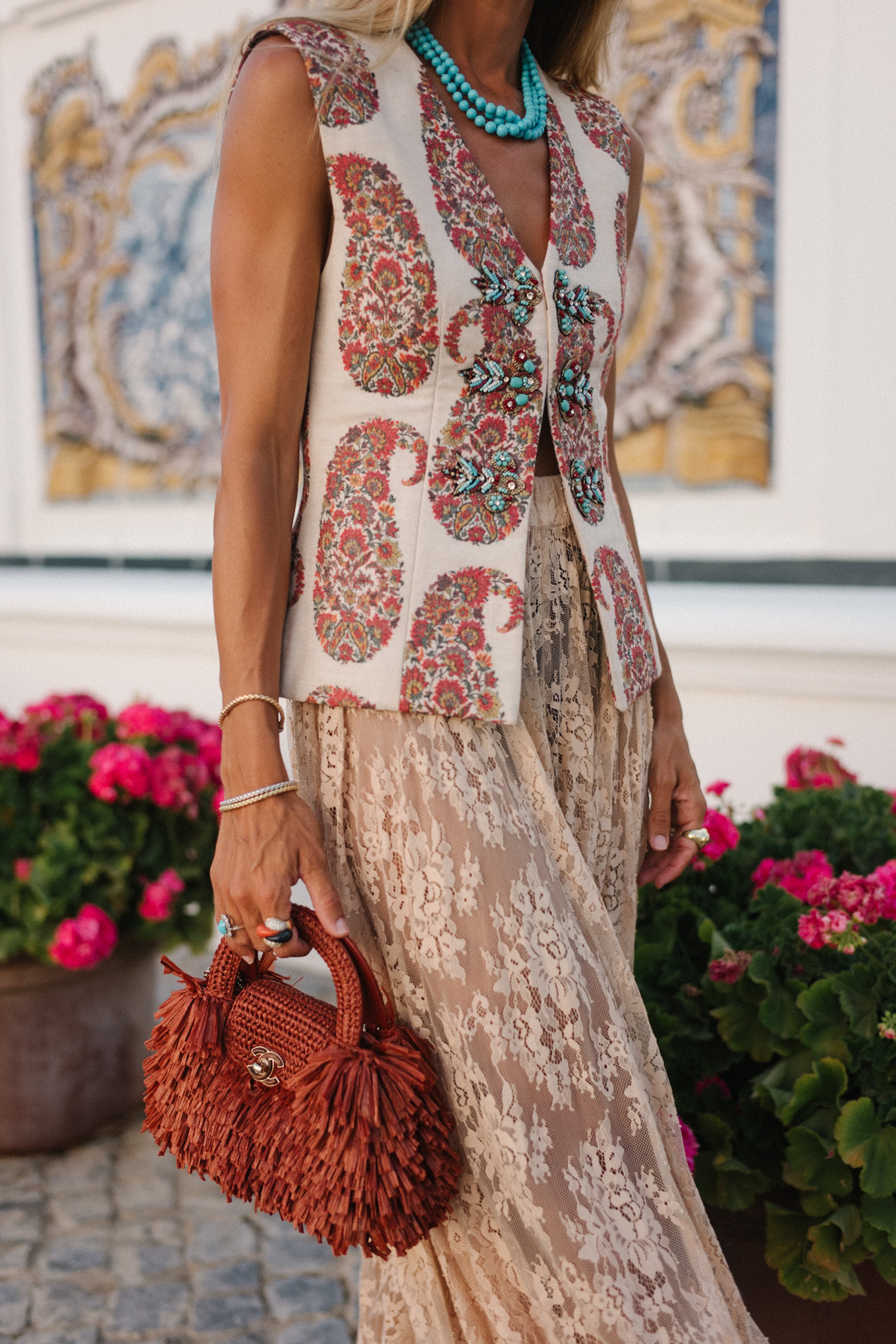
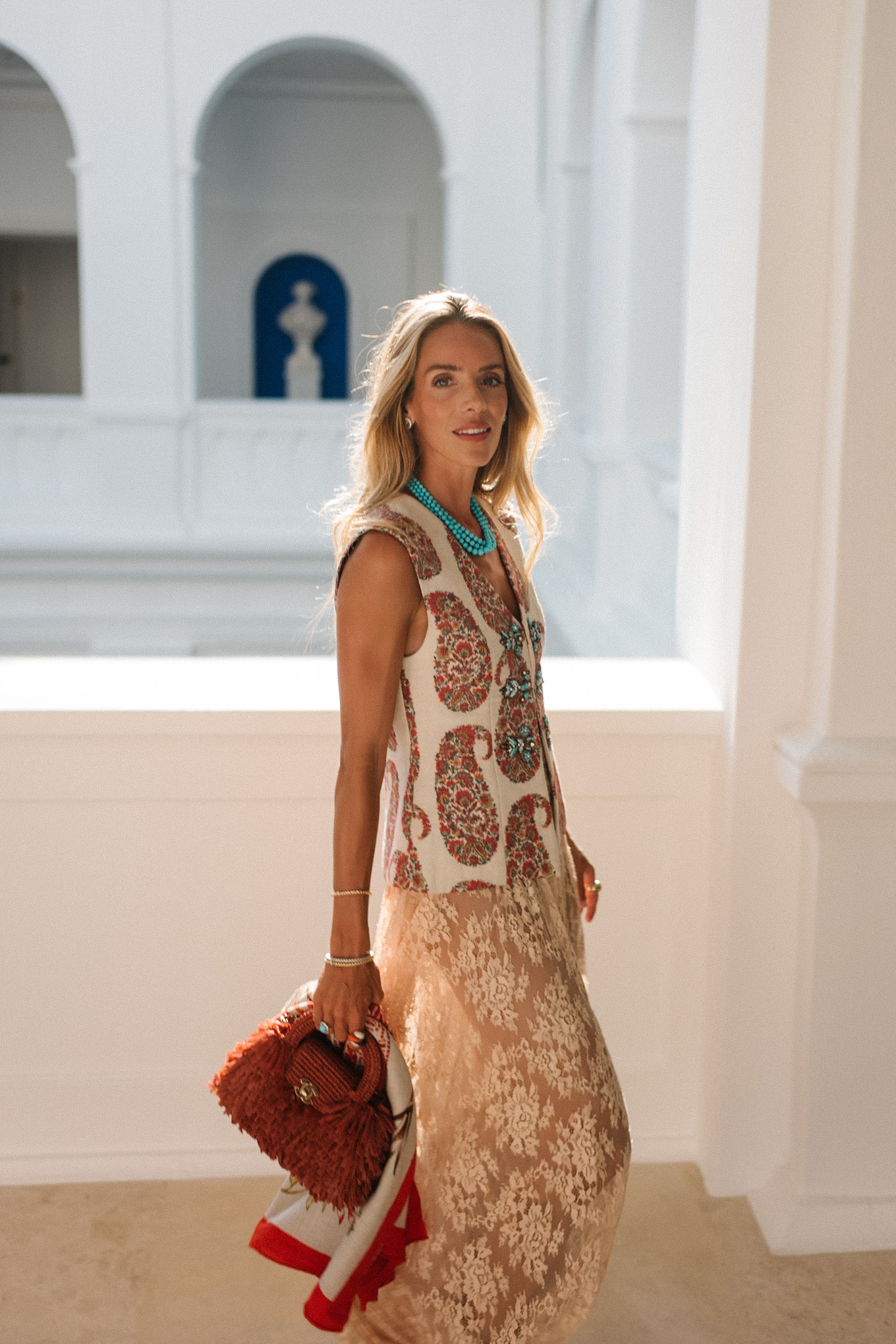
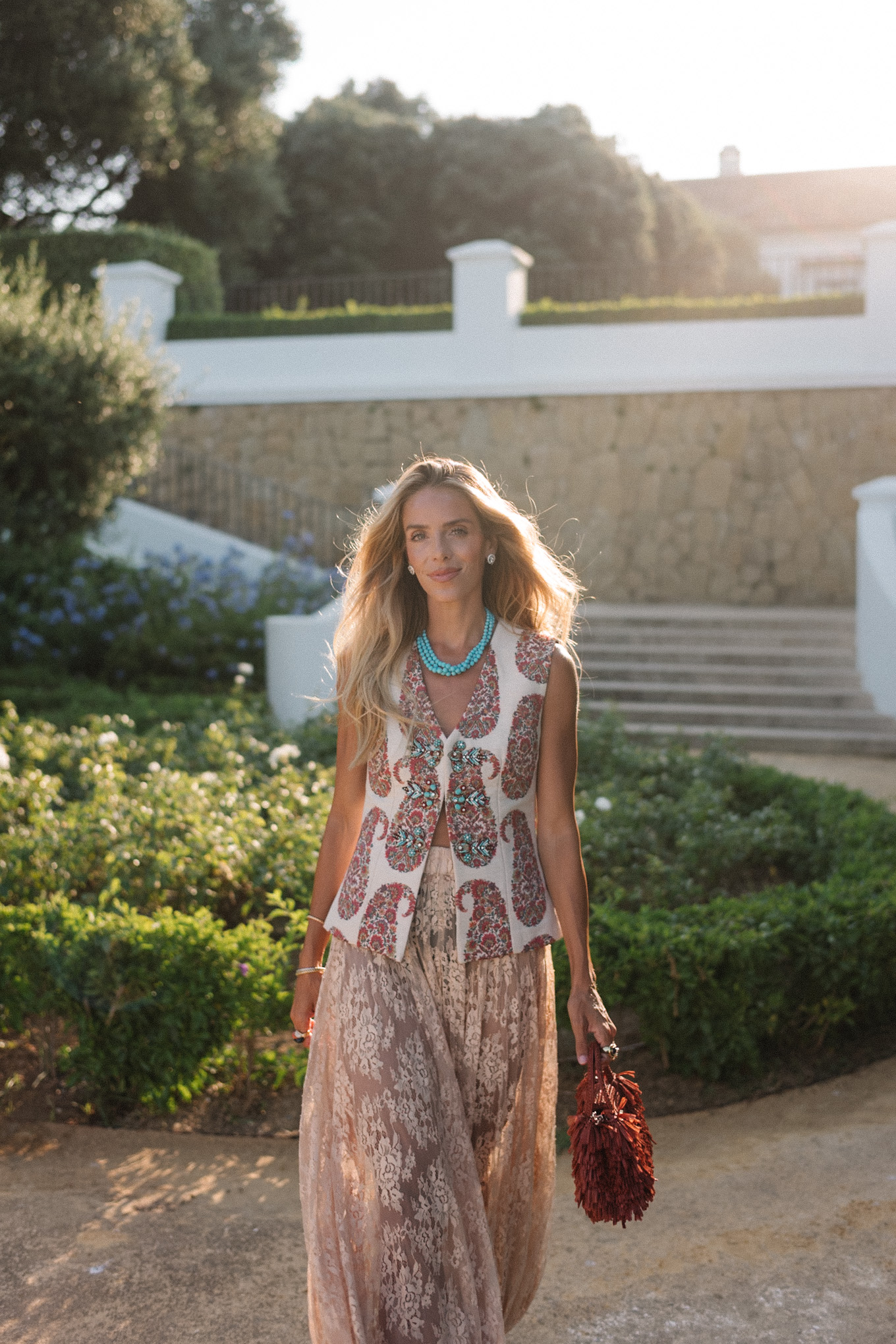
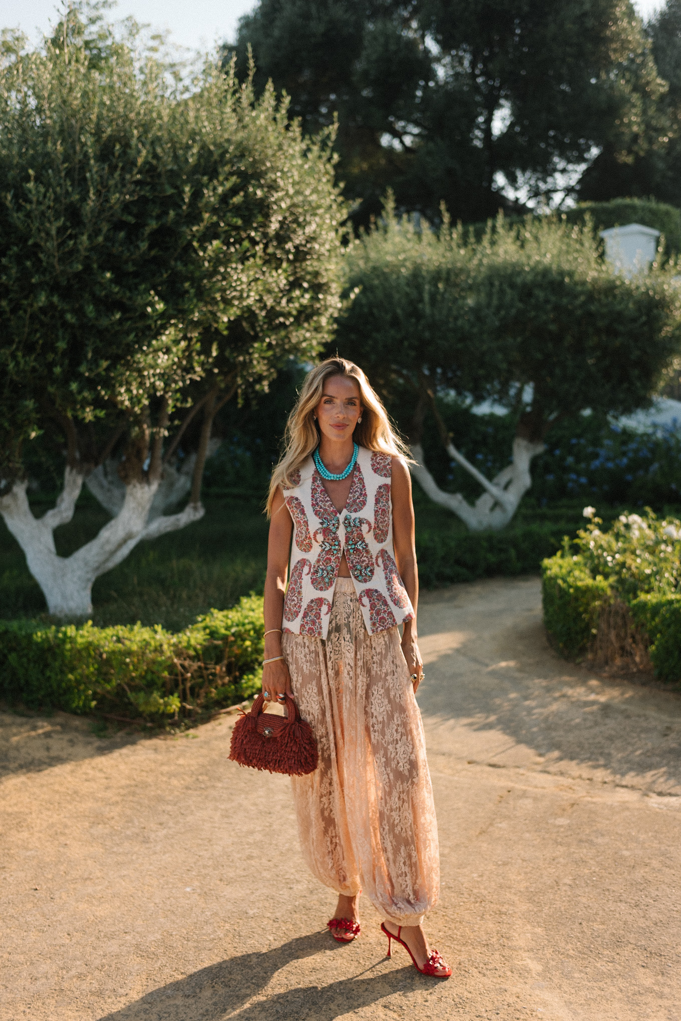
Rosewater House Vest (sold out, similar here), Sea NY Pants (sold out, similar here), Manolo Blahnik Heels, Chanel Bag, Irene Neuwrith Necklace (similar, less expensive here), Hermes Scarf (similar here)
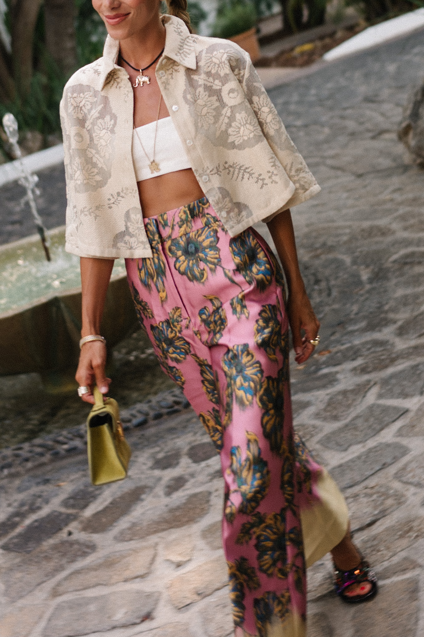
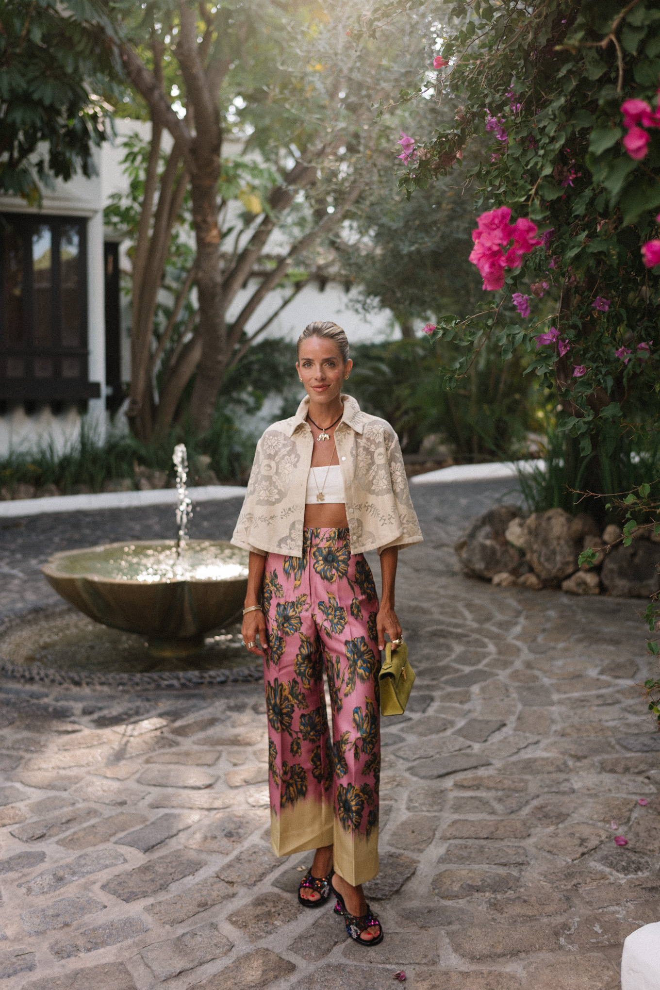
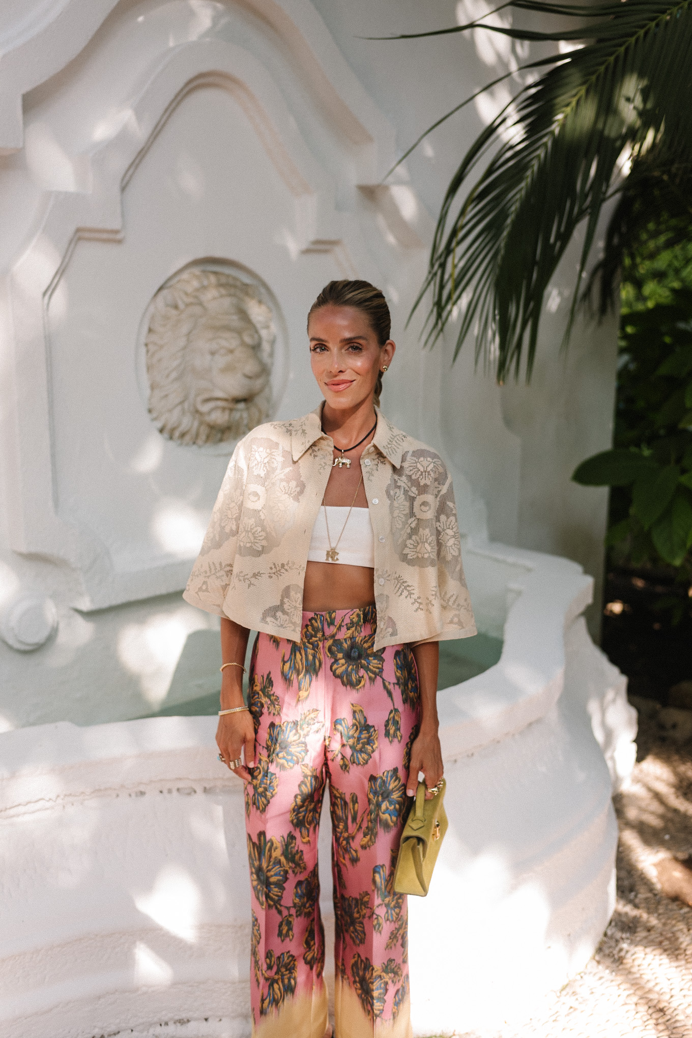
My favorite outfit equation usually starts with print, and then I use texture to add dimension. It gives a patterned look somewhere to land, something you notice after the color, so your eye travels through the mix instead of getting lost in it. In an outfit packed with color, something tactile makes the whole thing feel more considered, almost a resting point that lets you take in one vibrant pattern before moving on to the next.
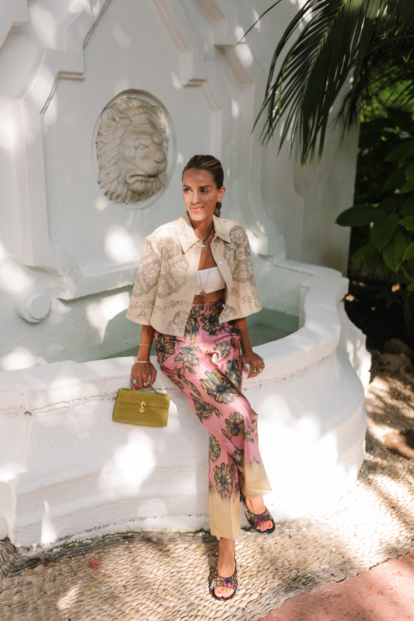
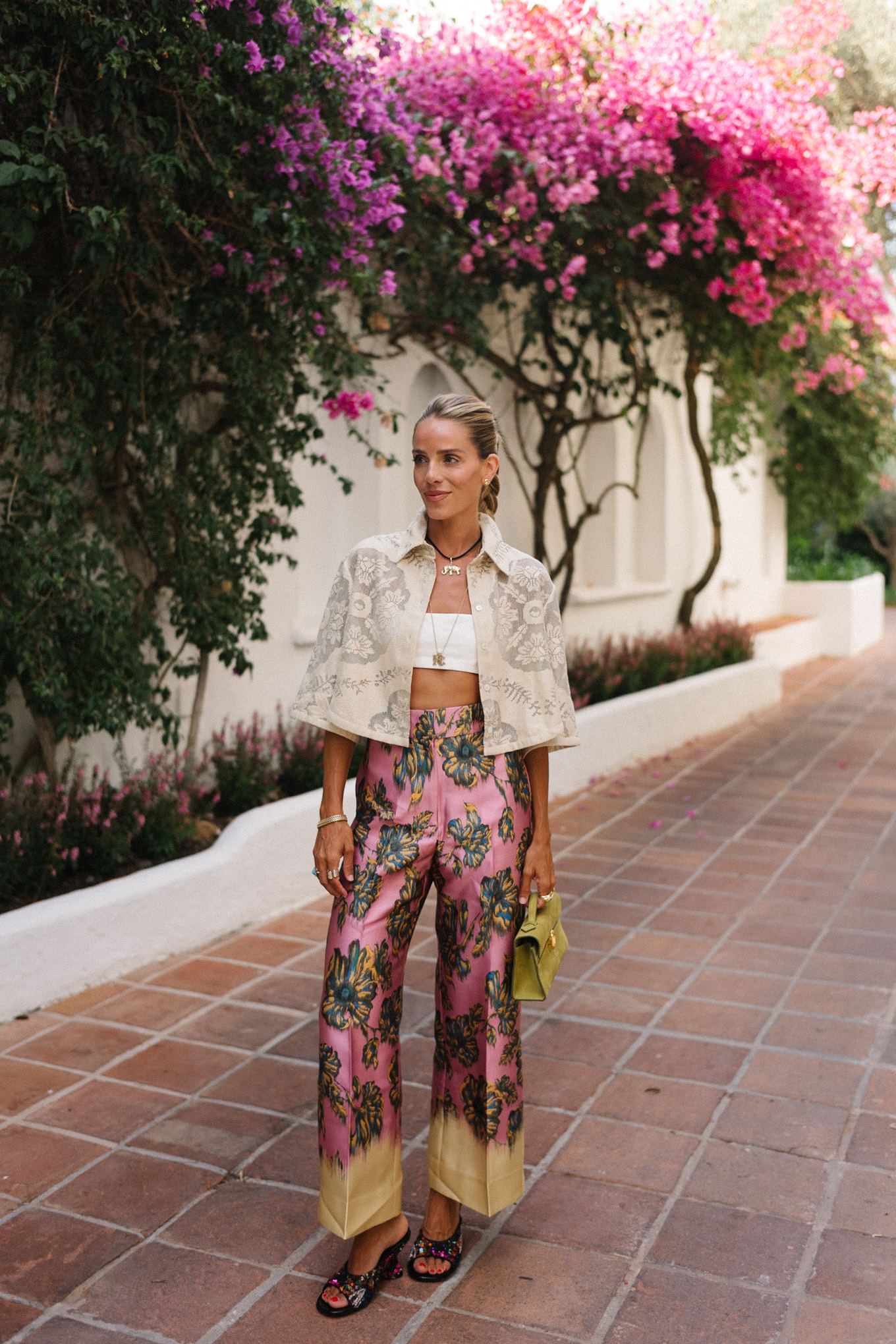
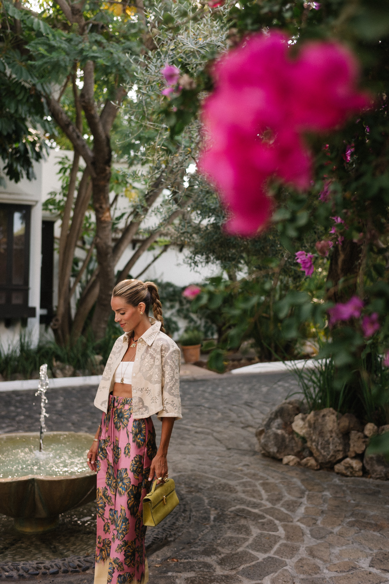
Valentino Shirt, Gwen Bra Top, Alemais Pants (more sizes here, matching top here), Dries Van Noten Wedges, Savette Bag (more colors), Jenna Blake Elephant Pendant
That is also why texture works so well when you want to lean further into print. The right piece can move between patterns without every shade lining up exactly, which keeps a busy look feeling connected rather than competing with itself.